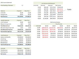
 1. The Cost-Volume- Profit Analysis data table show the result of several what-if analyses simultaneously. For example, if annual sales increase to 35K units, the company's revenue will be more than $997K, but the total expenses will be more than $797K , making a net income of $ 200K.
2. This chart plots the points of the above data table, connecting them with a line. The blue line represents revenue; the red line represents expenses. The break even point occurs at a sales volume of about 20K units. The data table and CVP chart give a comprehensive picture of the impact of sales volume on total expenses and revenue.
3. This chart shows a different trend line for each of the five possible scenarios.
4. The scenario summary report displays the values of the input cells and results cells under each scenario.
5. Another way to display the results of scenarios is with a PivotTable and PivotChart report.
6. This is same as in slide 1 above. Determining a value for price elasticity of demand involves a shrewd examination of the market, the product itself, and desires of consumers.
This by far is the most important part of this feature. It allows to calculate the new demand curve. In this sample a 20% was factored in.
This came from a project that I completed taking an advanced Excel course at a local college. I completed several of these projects and also completed a scenario on exam.
I would by happy to share other projects. However, this topic is very advanced and you be ready to devote some time in this. Once you learned this you will be well on the way to help your organization!


No comments:
Post a Comment